pbarber
Paul Barber’s github.io
Things I’ve made
Most recent first:
- Map Creator App
- NI Isochrones App
- Map of the Rivers and Lakes of Ireland
- NI COVID-19 data Twitter/X bot
Transatlantic passenger liner records
The Mauretania display at the Discovery Museum inspired me to look into the Blue Riband records for the fastest average Atlantic crossings for passenger liners. I couldn’t find a good visualisation of the crossing times, so made this one using Flourish.
The data processing code is here, based on a pair of tables loaded from the Wikipedia page linked above.
The Mauretania was switched from coal to oil in the early 1920s, going from burning 1,000 tonnes of coal per day to burning 610 tonnes of oil. These would have produced roughly 2,860 tonnes of CO2 per day for coal and 1,830 tonnes after the the conversion. Taking the fastest crossing that Mauretania made (4.45 days) and assuming the maximum possible number of passengers (2,165) was carried, this would put the CO2 emissions for each passenger for a single crossing at 5.9 tonnes (coal) and 3.8 tonnes (oil). This compares to roughly 1 tonne for a one-way flight from Heathrow to JFK today.
The best site I’ve found for calculating emissions for different modes of (modern-day) transport, including different legs via different modes, is lowtrip.
Sea level changes
I wanted to see whether I could identify sea level rises from open datasets. The British Oceanographic Data Centre hosts readings from the UK tide gauge network. I chose the gauge at Newlyn, Cornwall, as it has the longest, almost continuous record with data going back to 1915. I would have liked to have used the Bangor station, in NI, but the data after early 2016 is flagged as unreliable.
Whichever way I look at the Newlyn data, it is clear that sea levels have been rising over the last 110 years:
- the annual maximum (highest sea level each year) has increased by 30-40cm
- the average daily level has increased by 25-30cm
Looking at the data by decade, average sea level increased by 28 cm from the 1910s to the 2020s.
I also produced a model of the typical sea level for each decade, this shows that each decade since the 1980s has had higher sea levels than any previous decade in the dataset.
The code to create the dataset is here.
New year, new me
A quick New Year visualisation of Google search trends for ‘gym near me’ shows, unsurprisingly, that the New Year week is the most popular time of year for people looking for a gym in the UK. The only exception is 2021 when the peak was delayed until lockdown ended.
Data extracted from Google Trends using pytrends. Visualised with Flourish.
How not to fix a thing
I like fixing things, be they real or software. I recently pulled a pair of guitar pedals out from under a bed and attempted to fix them. In the end I sold one, a Carlsbro Echo, for spare parts and managed to fix the other, a Jim Dunlop GCB-95 Crybaby Wah.
The story of the Crybaby Wah fix goes as follows:
- The pedal didn’t work
- I diagnosed the problem as a broken 3-pin foot switch
- I fitted a replacement foot switch but the pedal still didn’t work
- I spent many hours checking the circuit and resoldering suspect joints
- I then spent more hours staring at circuit diagrams, becoming increasing confused before
- I eventually realised the online circuits didn’t match my version of the pedal (Rev F)
- I then spent many more hours drawing out the entire circuit using the excellent Falstad circuit simulator
- After creating a full online model of the circuit I realised that I had wired up the foot switch incorrectly
- I rewired the foot switch and the pedal worked
At point 7 above I felt like I had made an excellent decision to draw out the circuit. I’ve been in similar situations before, where the best approach is to spend time creating a model so that I have something reliable to compare against. However, attempting to apply good process after the fact sent me off down the wrong path.
I made an incredibly basic mistake much earlier on: at point 3 I should have taken my time. I rushed through the replacement without making any notes, assumed the switch was correctly wired and then wasted many hours due to that incorrect assumption.
So in summary I should have:
- Made good notes and not rushed
- Reviewed my previous work once I realised I had been rushing
Anyway, if anyone is ever in need of a relatively well tested model of a Rev F GCB-95 Crybaby Wah pedal, you can find it on Falstad circuit simulator or download the text file.
Google Trends visualised with Flourish
One for the non-squeamish living in close proximity to school age children: a rough analysis of the annual peaks in head lice and nits.
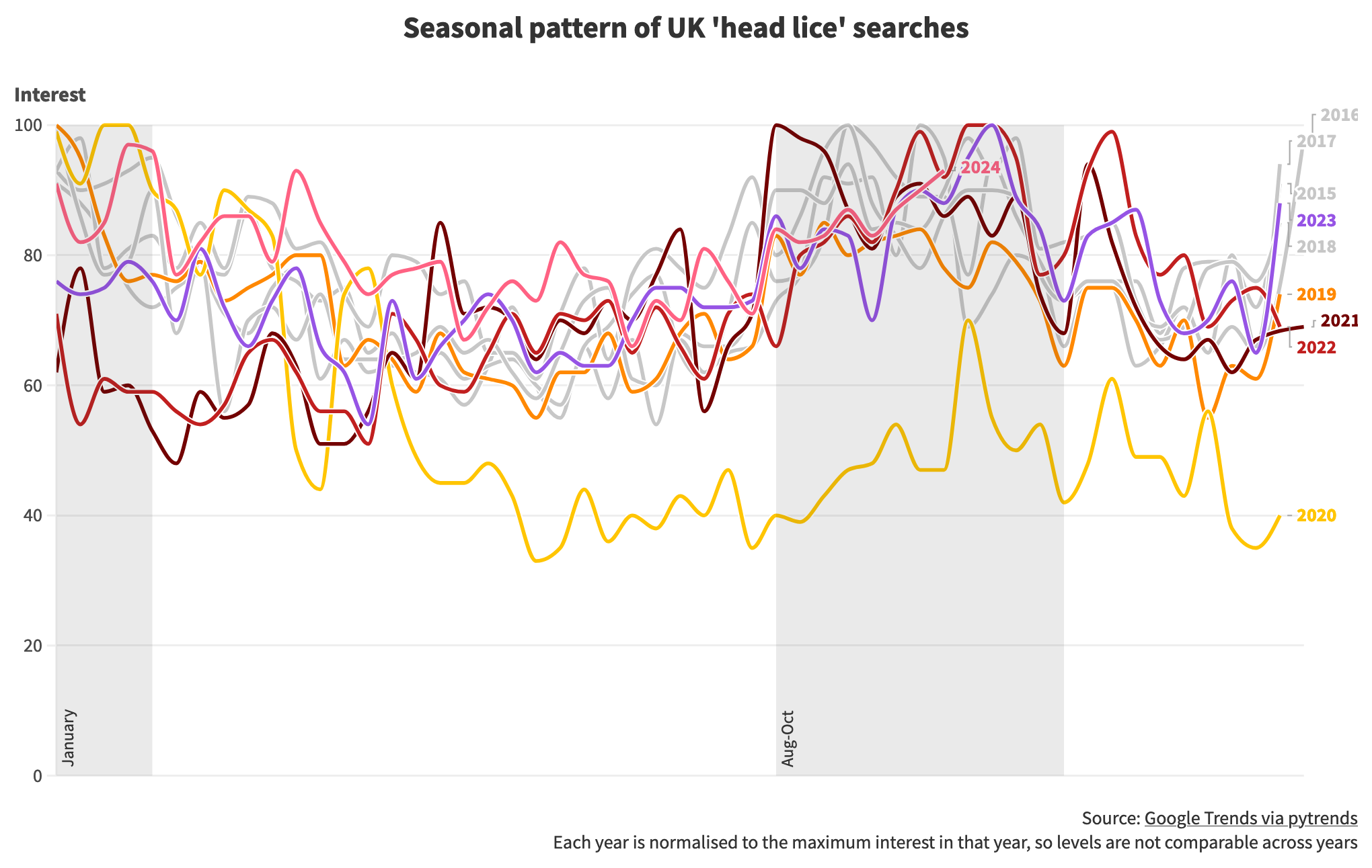
I haven’t used Flourish before, it’s a user friendly service for publishing good quality data visualisations with context around them. It would be even better with more support for data wrangling.
Cursor wrote the code to pull down the dataset from Google Trends using pytrends, demonstrating how the combination of web services, open source libraries and AI has changed coding into ‘specify and test’.
The code is here.
Isochrones map
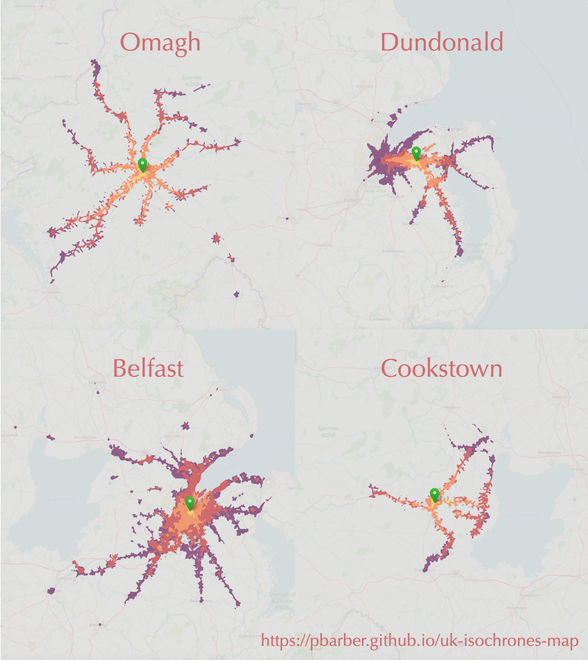
These are isochrones, which show how far you can travel from a starting point in a certain time. In this case, in one hour using public transport or walking from four locations in NI. The maps are based on a detailed open dataset that I haven’t seen visualised until now.
I’ve put together an interactive map so you can explore the dataset for yourself.
If there’s a good level of interest I may extend the interactive map to cover all of the UK.
Ireland’s river basins
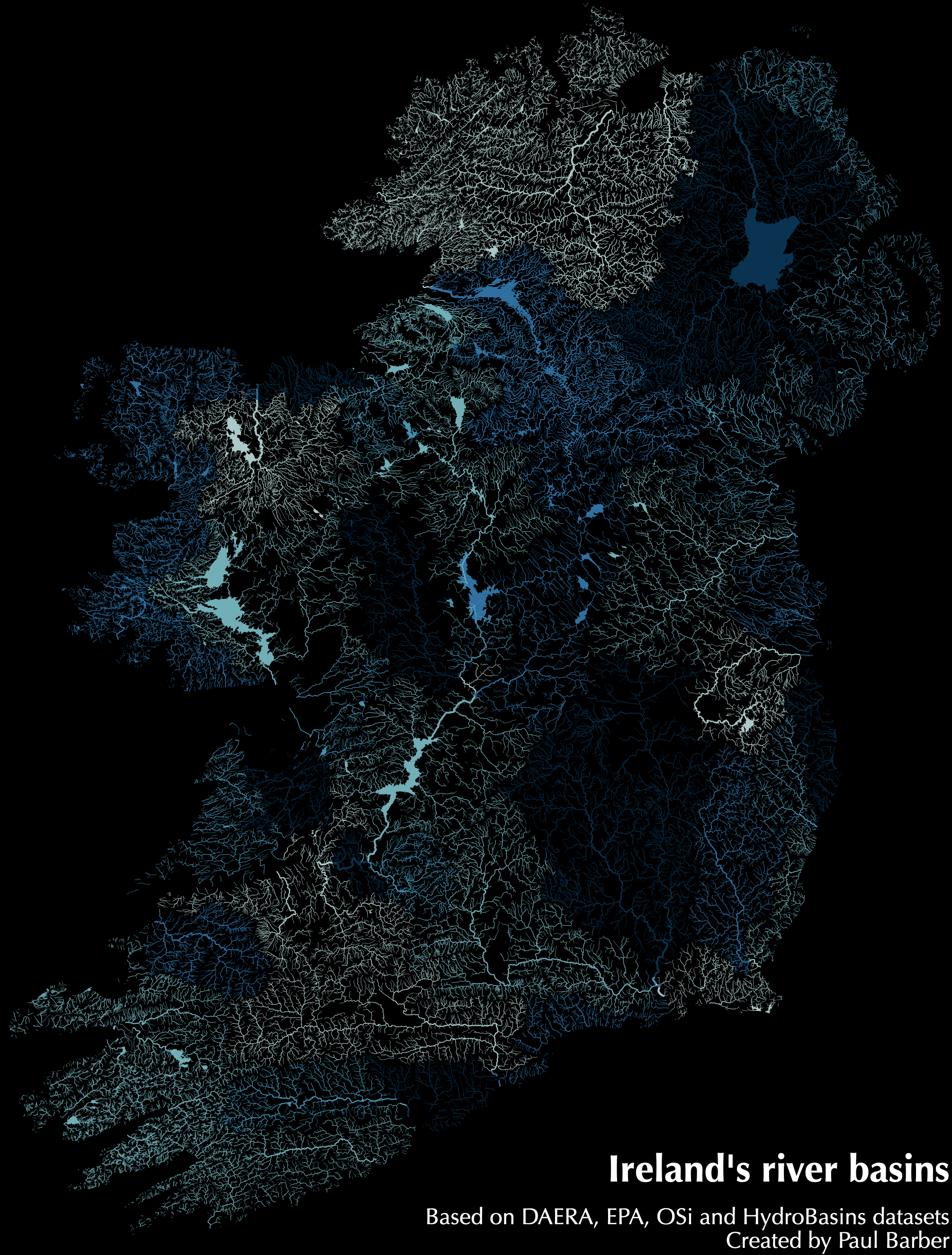
It’s amazing what is possible with less than 300 lines of code, some open data and several open source libraries. I put together this map of the rivers, lakes and streams of Ireland, coloured by river basin. A decade ago, this would only have been possible with months of effort or access to expensive specialised software.
Code and Numbers
I use this site to archive posts from my old company website at codeandnumbers.co.uk. Reading them now is a bit like reading my teenage poetry, if I had written any, both highly embarrassing and strangely comforting. The posts, newest first, are: